Showing posts with label maps. Show all posts

Friday, February 6, 2015

"Let Me See That Map!"


" 'Don't worry,' they said. 'We're solid,' they said. 'We've done this before,' they said. 'Trust us, we're experts,' they said."

Once again, the Lemming's album is labeled — cryptically. This one's in a different hand.

Posts that might be related to this one, or not:

Wednesday, November 9, 2011

Minneapolis Skyways: Warm Winter Walking

"Minneapolis Skyway System"
Wikipedia

"The Minneapolis Skyway System is an interlinked collection of enclosed pedestrian footbridges that connects various buildings in Downtown Minneapolis enabling people to walk in a climate-controlled environment. The extensive system is renowned as the largest continuous system in the world,[1] and is compared to the underground cities of Houston, Texas, and Canadian cold-weather cities Toronto and Montreal.[2]

"The system forms a network of climate-controlled, pedestrian walkways that link sixty-nine full city blocks over seven miles (11 km).[3]..."

From the Lemming's point of view, Minneapolis is 'down south,' and that's almost another topic.

The Minneapolis skyway system makes sense here in Minnesota, where words like "winter" and "cold" have a different meaning than they do in, say, San Diego. Or Brazilia.

St. Paul, Minnesota, across the river from Minneapolis, has a skyway system, too. And, until 2001, had an indoor city park. And that is another topic. As the Wikipedia article said, cities that have enclosed and climate-controlled pedestrian areas aren't all that uncommon. Not in North America, anyway.

One of the Wikipedia map links still works, but another fell victim to website 'improvements' since it was posted. After a little nosing around, the Lemming found two useful maps on the Minneapolis city website. (ci.minneapolis.mn.us) Since there's no telling how long those URLs will be useful, the Lemming archived both maps on a stable website:
The City of Minneapolis holds copyright on both those maps - and those links and archived copies are used without permission. More of the usual disclaimer: this discussion of Minneapolis skyways; display of image(s); links; and use of the letter M; are not intended to imply endorsement, or any other sort of connection, with the City of Minneapolis.

And, while the Lemming is thinking of it:
  • Observe traffic rules
  • Not for internal use
  • Drive safely
  • Recycle
Almost-related posts:

Wednesday, January 5, 2011

Shifty Surface on Mars?

"Surface of Mars Possibly Shaped By Plate Tectonics In Recent Past"
Mike Wall, Space.com (January 3, 2010)

"A patch of land near the huge Martian volcano Olympus Mons may bear evidence of recent plate tectonic activity on the Red Planet, new research suggests.

"The many ridges and scarps on the rumpled apron of land north and west of Olympus Mons are likely signs of tectonic thrusting, according to the study. And this activity could be very recent — within the last 250,000 years or so.

"If the study's conclusions are confirmed, they would overturn conventional wisdom, which holds that plate tectonic forces are unlikely to have played a major role in shaping the surface of Mars - particularly in the recent past...."


(NASA and An Yin (UCLA), via Space.com, used w/o permission)

Hats off to Mr. Wall, the article's author, for taking time to explain some of the ideas involved in this new development of our knowledge (and speculation) of Mars:

"...'People don't want there to be plate tectonics on Mars,' said study author An Yin of UCLA, who presented his findings in December at the fall 2010 meeting of the American Geophysical Union in San Francisco. "But I think there's good evidence for it." [Mars map suggesting recent plate tectonic activity]

"A shifting surface?

"Earth's surface has been shaped over the eons by giant crustal plates that pull apart, smash together and dive under one another.

"These plates slide around on a layer of partially molten rock called the mantle. Earth's interior is hot enough for mantle rock to remain in a soft, relatively plastic state, partly because our planet is relatively large. The more massive a planet, the hotter it is on the inside.

"Mars is much smaller than Earth - about half as wide, and only 11 percent as massive. Consequently, many scientists think the Red Planet is too small, and its interior too cold, to host plate tectonic processes...."

The Lemming particularly appreciated the term, "half as wide." Too many writers use "big" in situations like this: leaving the reader to guess whether they mean diameter, volume, mass, or something else.

Mars (maybe) having recently-active tectonic plates is, first, unexpected. And still debatable. Debated.

Whether or not crustal plates on Mars moved around recently is important to the search for life on Mars, as well as the (geology?) of the planet. There's good reason to believe, as the article pointed out, that Earth's crust being recycled on a regular basis is part of what makes this a fit place to live.

Finally: "Recent" and 250,000 years may not seem to belong in the same sentence. That's a long time, on the scale we use to think about the World Cup or mortgage payments.

Looking at the 4,500,000,000-plus Earth - and Mars - have been around, though? 250,000 years ago is practically contemporary.

Somewhat-related posts:More related posts, at

Friday, October 29, 2010

What Happened to Argleton?!

"Welcome to Argleton, the town that doesn't exist"
guardian.co.uk (November 3, 2009)

"The world's eyes are focused on a small village called Argleton just off the A59 near Ormskirk, Lancashire. Camera crews have been dispatched. "Argleton" is fast becoming a popular hashtag on Twitter. There is even talk of merchandising opportunities.

"The reason for all the interest is simple: Argleton doesn't actually exist. It is a phantom village that appears on Google Maps. You can search online for Argleton's local weather forecast (10C yesterday), property prices (not much for sale at the moment) or for the number of a local plumber, but in reality the village's coordinates point to little more than a muddy field. However, just a few hundred metres away stands the very real village of Aughton. So, is this a case of a simple spelling mistake by a cartographer? Or is Argleton evidence of something more conspiratorial afoot in the county? After all, the Ormskirk and Skelmersdale Advertiser has already posed the question of whether the Argleton mystery might indicate the presence of a 'Bermuda triangle of West Lancashire'...."

The Lemming rather likes the idea that a vast conspiracy of space aliens, Elvis and the Knights Templar is involved - and that Argleton really does exist - cleverly hidden by holographic projectors and mind-control rays from the invisible mothership.

None of which are mentioned in the article.

See? That proves there's a conspiracy!

Let's see: Edge Hill University in Ormskirk's head of web services, Mike Nolan, says it's most likely that somebody's fingers skidded when they keyed in "Aughton" - and it came out "Argleton."

Not as cool as the space-alien explanation - but a great deal more plausible.

Or is that what they want us to thing?!

The Lemming has got to get some rest.

Saturday, August 28, 2010

Map the Titanic: Big Ship, Big Job

"Titanic Wreck Mapping Begins"
Tech News, Discovery News (August 27, 2010)

"A high-tech expedition that aims to create a detailed map of the wreckage of the Titanic has begun exploring the ocean floor where the ship sank nearly 100 years ago, the crew said Thursday.

"Sonar onboard an automated submersible vehicle combined with high-resolution video will be used to create three dimensional images of the fabled oceanliner.

"The expedition, organized by the American group RMS Titanic, which holds exploration rights for the wreck, arrived on Wednesday aboard the scientific vessel Jean Charcot and started by laying flowers on the water's surface to commemorate the 1,500 victims of the shipwreck...."

Discovery News has another page about the mapping mission: www.expeditiontitanic.com.

The Titanic's may be the best-known shipwreck in recent history. The huge ocean liner went down on April 15, 1912, taking about 1,500 people with it. The notion that the Titanic was assumed to be "unsinkable" seems to have been more common after the colossal ship sank, than before. And that's another topic:The current mapping expedition uses robot submersibles, sonar and a video camera: and is trying to make "the most detailed portrait of Titanic's wreck site to date."

Viewed strictly as an archeological site, there's going to be a great deal of valuable data gleaned from the wreckage: and, given the Titanic's position as a cultural landmark, a lot of popular interest, too.

Saturday, May 1, 2010

BBC 'Map' Video: Digital Worlds

"The Digital Worlds - The Beauty of Maps - BBC Four"
BBC, YouTube (April 23, 2010)
video, 2:38


"More on this programme: http://www.bbc.co.uk/programmes/b00s2w83

"This film looks at the way cartography has changed and entered an age of digital map-making.

"Denis Lawson explains how digital mapping is shaping the future, letting us see into virtual spaces and into the infinite unknowns of outer-space.

"Each image is a breath-taking first look at the world today, showing the extent of human endeavour in the most beautiful ways possible."

There's a bit of the familiar old "once it was believed, now we know" attitude in the video's introduction - but there was an enormous increase in how much data we have, and the power of our tools to analyze the data, in the 20th century.

A nitpicking detail: The "dark side of the moon" isn't any darker than the side that faces us. It goes through the same day-night cycle. What's "dark" about it is that it was, until we started sending ships out there, unknown territory. So, as a metaphor, I suppose "dark" is okay.

The video has remarkable graphics, presents a lot of information (and a perceptible attitude) quickly - without seeming rushed. In my opinion.

If some of the graphics look familiar, you've probably checked out "Data Driven Art..." (January 27, 2010)

Related posts:Or, click "Maps" on this blog's Label Cloud.
A tip of the hat to timethief, on Twitter, for the heads-up on this video.

Tuesday, March 9, 2010

Vespucci: Not Bad for a Son of a Notary

"March 9, 1454: This Man Is a Continent … or Two"
This Day in Tech (March 8, 2010)

"Vespucci, the son of a notary, went to work for the Medici banking house. They dispatched him as an agent to Seville, Spain, where he arranged the fitting out of ships and the trading of their cargoes.

"He seems to have been in Seville when another Italian in Spain, Christopher Columbus, returned to the nearby port of Cadiz from his first journey to the West Indies. Vespucci later helped Columbus prepare his vessels for the Genoese mariner's second and third voyages of discovery...."

So far, Mr. Vespucci sounds like a nice enough chap: the sort of person whose job is a what we'd call a white-collar position, somewhere between bank officer and clerical expediter (DOT 222.367-018). Not, though, the sort of person you'd expect to be remembered five centuries later, when almost all jobs had names - and nine-digit numeric codes.

Mr Vespucci was an agent for the Medici banking house, remember: and he showed initiative by setting up his own expedition, after Columbus established the practicality of reaching the Indies by sailing west. (Not that the world was round: that had been known for centuries - Ptolomy's Almagest and all that - and another topic.)

Mr. Vespucci's second expedition was what put him on the map. He decided to explore the coast of the Indies - the lands of India. Which he did, traveling south along the coast until he came to the area we call Patagonia these days.

Another 400 miles, and he'd have reached Tierra del Fuego.

The coast looked like nothing that Europeans had seen. Not the post-glacial lot, anyway. Which is yet again another topic.

Back in Europe, Mr. Vespucci assembled data and published a map. Thanks to breakthrough information technology that had been invented, the printing press, copies of his map spread through Europe.


(Martin Waldseemüller, via Wired, used w/o permission)

Back to the Wired article:

"...Martin Waldseemüller, a modernist-humanist German clergyman and cartographer, reprinted 'The Four Voyages of Amerigo' in 1507 with his own 'Cosmographic Introduction.' He opined:
" 'I see no reason why anyone should justly object to calling this part … America, after Amerigo [Vespucci], its discoverer, a man of great ability.'
"Waldseemüller included a map of the the new lands, on which the name 'America' makes its earliest appearance...."

I'm on the same page as the article's author:

"...Vespucci died in Seville in 1512. Though he reached America after Columbus (and others), it is not unjust that two continents are named in his honor. He does seem to have originated the idea that the new lands were not merely offshore islands of Asia. He reorganized the data, he shifted the paradigm, he deserves the eponym...."

Works for me.

There's more to the article: I think it makes good reading, and tells a bit more than many about Amerigo Vespucci, who put the Americas on the map.

South America, anyway.

Friday, December 18, 2009

Where the Birds are in Minnesota

"M.O.U. Species Distribution"

"Included here are nesting range maps for those species which normally nest in the state, and the approximate location(s) where migrants, winter visitants, casual and accidental species occur or have occured[!].

"For regularly occuring[!] species which are strictly migrants, summer visitors or winter visitors, the maps attempt to depict those areas where these species are most often or most likely to be found. Not every record is depicted for migrants, as they can often occur anywhere. In those cases where migrants usually occur in a very restricted area, (e.g., Parasitic Jaeger, Red Knot), only those locations are shown, even though records from other areas may have been recorded.

These maps are only intended to be used as a general guide....
"

Then, after a bit more text, what I'd have thought would be the page title:

"Range Maps for Minnesota Birds"

Birds from "Ducks, Geese, Swans" to "Old World Sparrows," by way of maps showing where plovers, herons, egrets, bitterns and New World vultures: the latter are turkey vultures, found in the northeastern parts of the state.

That arcane acronym, M.O.U.? It stands for The Minnesota Ornithologists' Union.

Bottom line? This is a pretty good resource for looking up the ranges of birds in Minnesota. And yes, we've got more than sparrows, ducks, loons, crows - and turkey vultures.

Wednesday, July 1, 2009

Photo Map: 99 Percent of Earth

"New map shows 99 percent of Earth's terrain"
CNN (July 1, 2009)

"NASA and Japan improved our world view this week, or at least our view of the world."

"The American space agency and Japan's Ministry of Economy, Trade and Industry have released a new digital topographic map of Earth that accurately portrays more of our planet than ever before."

"The new map consists of 1.3 million images taken by NASA's Terra satellite that have been pieced together...."

The new map is, essentially, a huge composite photo of Earth's surface. Aside from the 'gee whiz' factor, this map should be useful for people who want or need detailed information about a location.

For example, I've used satellite imagery from Google Maps to plan a trip to another town: Conventional maps are fine for getting from town to town, but they don't show details like where the parking lots are.

Saturday, June 13, 2009

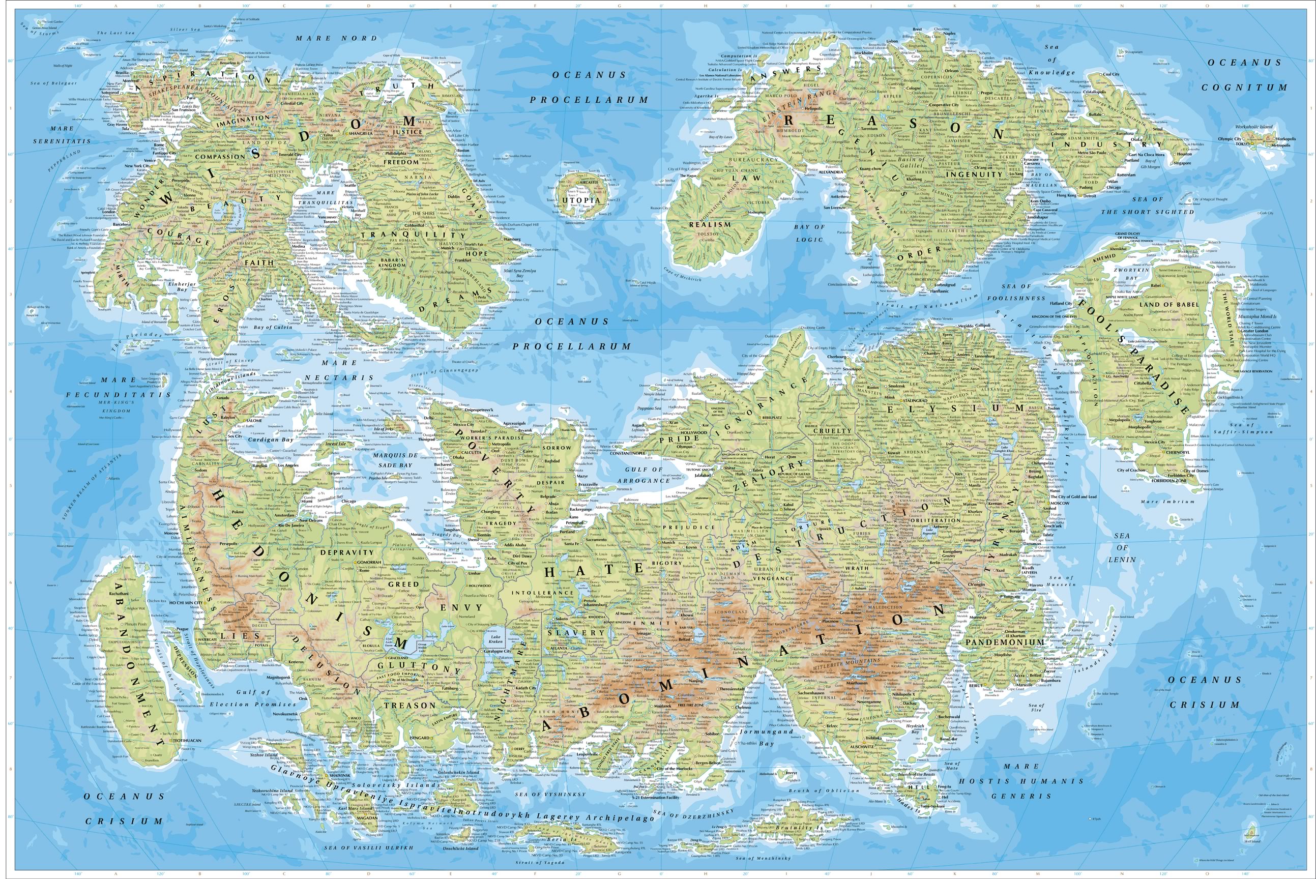
Map of Humanity: World of Concepts, People, and Imaginary Places as Geography


Joey deVilla’s Personal Blog (undated, probably September, 2007)

As a rule, I don't do these graphics-as-a-Web-page things. But, in this case I'll make another exception ("Look at This Duck! A Giraffe and a Duck" (June 5, 2009)).

The (island? continent?) of Wisdom has some of my favorite names from on the map: the Beethoven Range, Narnia, The Shire, and the Land of Oz.

Somebody put a lot of work into creating this map: and I couldn't find anything about its origins.

Quite an impressive bit of graphic art.

Saturday, March 14, 2009

Happy birthday, Giovanni Schiaparelli: Observer of Canali on Mars

Happy birthday, Giovanni Schiaparelli.

He's the Italian astronomer who observed channels on Mars in 1877. Being Italian, he wrote that he had observed channels: "canali" in the Italian language. Someone translated Schiaparelli's notes into English, and decided that "canals" was what "canali" means.

Percival Lowell, American Astronomer, read Schiaparelli's notes, as (mis-) translated, and saw canals on Mars. Lots of them.

Pretty soon, just about everybody with a telescope was seeing canals on Mars, which proves that there must be Martians to build the canals. Or that there were, until very recently.

Edgar Rice Burroughs wrote quite a few books about Barsoom - but I'm getting off topic.

Don't be too hard on Lowell and company: An engineering megaproject of the day, the Suez Canal, had been completed 1869. People were thinking "canals," pretty much the way we're thinking "hybrid" and "digital" today.

One more thing: Yes, Giovanni Schiaparelli was color blind. Which may not have had much to do with his seeing channels that weren't there.

Mars, seen from Earth, particularly if you're using an 8.75-inch telescope (0.2 meters), is a small, shaky, roundish thing with indistinct markings.

Before astronomers could send robot observatories into space, they had to look at the universe through Earth's atmosphere: which is very good at keeping us alive, but far from optically perfect.

So in the good old days, astronomers might wait for moments of good seeing, and sketch what they saw.

We've learned quite a bit about the human brain's visual system lately: we're really good at pulling patterns out of visual data that has a great deal of noise. Sometimes, the patterns are actually there. Sometimes, as was the case with Mars, they're not.

Credit and Copyright: Tom Ruen, Eugene Antoniadi, Lowell Hess, Roy A. Gallant, HST, NASA

Or, rather, aren't quite there. When maps of Mars, based on eyeball-on-Earth observations, are compared to maps based on photos and other data from survey ships, there's a pretty good match between the major "Schiaparelli" features, and patterns of dark and light material on Mars. What's missing are the neat, straight, lines that our brains used to 'connect the dots.'

Credit and Copyright: Tom Ruen, Eugene Antoniadi, Lowell Hess, Roy A. Gallant, HST, NASA

More about Giovanni Schiaparelli, Mars, and all that:
Mars Maps and Resources:


(ABSABS: The SAO/NASA Astrophysics Data System. "The SAO/NASA Astrophysics Data System (ADS) is a Digital Library portal for researchers in Astronomy and Physics, operated by the Smithsonian Astrophysical Observatory (SAO) under a NASA grant. The ADS maintains three bibliographic databases containing more than 7.5 million records: Astronomy and Astrophysics, Physics, and arXiv e-prints. The main body of data in the ADS consists of bibliographic records, which are searchable through highly customizable query forms, and full-text scans of much of the astronomical literature which can be browsed or searched via our full-text search interface. Integrated in its databases, the ADS provides access and pointers to a wealth of external resources, including electronic articles, data catalogs and archives. We currently have links to over 8.1 million records maintained by our collaborators."

Cool, huh?

Other posts, about "Mars, Mostly."

Tuesday, February 24, 2009

Atlantis? Space Aliens? Nope: Ship Tracks

"Atlantis? No, it Atlant-isn't."
Google Blog (February 23, 2009)

"[Note: Last week we saw some interesting speculation that Atlantis had been found in Google Earth. As much as we'd love for that to be the case, there is a scientific explanation for the odd markings found on the seafloor. We've invited two of the scientists who gathered the data that appears in Google Earth to answer some questions that came up. - Ed.]

"Since the launch of Ocean in Google Earth, millions of people have started to explore the ocean, and many have been surprised by their discoveries...."

This is the image that got in the news last week:


(from the Official Google Blog, used w/o permission)

The idea that it's Atlantis is what was in the articles I saw. Google reports that farms run by space aliens was another explanation.

Turns out, those odd marks are artificial after all. They're called "ship tracks." What we're looking at are marks left in the mapping data, showing where the mapping ships went.

Google goes into more detail about it.

Of course, space aliens still might be involved: or Elvis. Somehow, though, I doubt it.

Tuesday, February 3, 2009

Google Earth Gets Wet

"Dive into the new Google Earth"
Official Google Blog (February 2, 2009)

"As you read this, I am at the beautiful California Academy of Sciences, announcing the launch of the newest version of Google Earth. This launch is particularly special to me because it marks the moment when Google Earth becomes much more complete — it now has an ocean.

"Didn't Google Earth always have an ocean? Technically, yes, well, sort of. We have always had a big blue expanse and some low-resolution shading to suggest depth. But starting today we have a much more detailed bathymetric map (the ocean floor), so you can actually drop below the surface and explore the nooks and crannies of the seafloor in 3D. While you're there you can explore thousands of data points including videos and...."

This is a little more exciting for me than it may be for you: I remember when the first detailed maps of the seafloor started coming out, four decades ago. Being able to Google "the nooks and crannies of the seafloor in 3D" lets me re-live a bit of my youth. This time, interactively and in 3D.

Friday, January 30, 2009

How Deep is Minnesota Snow? Now You Can Know!

"Weekly Snow Depth and Snow Depth Ranking Maps"
University of Minnesota's Minnesota Climatology Working Group (last update January 29, 2009)

If your life won't be complete, if you don't know just how much snow has fallen on Minnesota, there's hope! The University of Minnesota's MCWG puts maps online at weekly intervals (more or less), showing how much snow is where in the Land of 10,000 Lakes and 10,000,000,000 Mosquitoes.


(from Weekly Snow Depth and Snow Depth Ranking Maps, used without permission)

From what I see on the map, and what's outside where I live, my guess is that the color coding goes to feet and inches after the color for eight inches. I wouldn't mind seeing an explanation for that somewhere.

For what it's worth, that means that there's a foot and a few inches of snow on the ground around here - on average.

There are "snow depth ranking" maps, too, and an explanation of what that means.

They've got maps going back to the winter of 1996-97.

Wednesday, December 17, 2008

Death Map: If the Cold Doesn't Get You, the Heat Will

"U.S. Death Map: Where and How Nature Kills Most"
LiveScience (December 16, 2008)

"A new map plotting deaths resulting from forces of nature reveals where Mother Nature is most likely to kill you.

"People living in the South along the Atlantic and Gulf Coasts have a higher likelihood of dying from a natural hazard compared to residents of the Great Lakes area and urbanized Northeast.

"And while intense hurricanes and tornadoes steal...."


(From Borden and Cutter/BioMed Central Ltd., via FOXNews, used without permission)

I was surprised to see that much of northern Minnesota had an average or below-average death rate from natural causes.

My guess is that not many people willingly move to northern Minnesota, and the ones born there are descended from those who had what it takes to survive fuel-freezing cold, tar-melting heat, droughts, floods, blizzards, mosquitoes, and marshes that look like meadows.

Across America, almost six out of ten natural-disaster deaths happen because of heat/drought, severe summer weather, or winter weather. And northern Minnesota has all three, if you wait long enough. The fishing and hunting is pretty good, though.

More, at

Sunday, November 9, 2008

Maps: Lots of Little, Tiny, Maps

"Map Collection"
Mapmaker Plus

Maps. Old maps. Not-so-old maps. Accurate maps. Inaccurate maps. Maps of Anglia, Asia, and places you never heard of.

Did I mention, this page has maps? Lots of maps. Thumbnails of little maps. Tiny maps.

Fun, attractive, but probably not very practical. Still, it could be fun to take a look.

Tuesday, August 26, 2008

Maps of Military Encounters from Ancient to Post-Roman times

"Atlas for Ancient Warfare"
West Point Academics

A good collection of maps, including "The Persian Empire, 490 B.C.," "The Battle of Thermopylae and Movements to Salamis," "Routes of the Barbarian Invaders, 4th and 5th Century."

There's not much in the way of bells and whistles, but it's a good information resource.

Friday, July 18, 2008

Historical Maps - No, Really - This is Cool

Well, I think it's cool.

"The map as history"
"A site which offers a personalized multimedia atlas of world history"

"By downloading one or several series of animated maps from our current and future catalogue, you and your family will gradually create your personalized multimedia atlas of world history...."

"...On-line animated maps
"Nearly 120 animated maps are already available in 6 separate series..."

On the down side, the earliest period and area is "Europe and Nations 1815-1914." For me, that's not very long ago. Although I'll grant that the nineteenth and twentieth centuries saw some pretty lively change.

Another thing: these maps are very Euro-centric. Just as they leave out everything before 1815, there's precious little about what going on outside Europe and the Middle East.

Still - a pretty cool resource.

For a history buff like me, anyway.

Friday, June 27, 2008

Where's the Other Side of the World? Find Out!

"Tunnel to the Other Side of the Earth"
Free Map Tools

"Have you every wondered which part of the other side of the earth is directly below you? No, neither have I, but you can find out using this Tunneling Tool."

Not very practical, but a lot of fun. If you like that sort of thing. Which I do.

Friday, June 6, 2008

Google Earth Maps / Disney World Interactive Fly-Through - This is Fun!

The odds are pretty good that this is the only way I'll get to Disney World. I read about Disney World being mapped into Google Earth, "in what Disney claims is the largest corporate entry on Google Earth" - as it said in the news.

I heard about the new gimmick on the news this morning, decided to try it out, and found a link to Disney World's introduction.

A video with Ludwig von Drake as narrator introduced me to the Disney/Google Earth 3D interactive flythrough. Then the video started replaying. I don't know if it's on an endless loop, and I'm not going to find out.

There's a catch to this Disney World map. Actually, two.

First, you'll need "the latest version of Google Earth" ("Google Earth 4.3, according to an Australian news article).

Second, this 3D virtual Disneyland isn't for older, slower computers. The good news is that Google Earth is free, and so is the Disney service.

I tried it with Google Earth 4.2. I could use it to find my way around, and get some information, but it wasn't 'as advertised' (naturally). Even so, it was pretty impressive to someone like me, who was around when 16-color graphics was a cutting-edge breakthrough.

So, I upgraded to Google Earth 4.3, tried it again - saw the same flat, very non-3D views.

Oh, wait.

When all else fails, read the instructions.

It's pretty clear that you're supposed to put "Show Disney World in 3D" in a popup (which didn't appear on my screen - no surprise, since I've opted out of popups). A button, quite prominently placed near the top of the screen, was labeled 'see this in 3D, you nitwit' - except the button was more polite.

I did, and buildings started popping out of the flat map.

I clicked the Mickey Mouse ears, and was on my way. After getting the hang of the controls, I flew under the monorail and at treetop level, past some of the attractions.

Actually, a little under treetop level. If I'd been in a real aircraft, I'd have probably made national headlines.

"Google Earth maps Disney theme park"
NEWS.com.au (June 6, 2008)

"WALT Disney was right: it's a small world after all.

"The sprawling Walt Disney World theme park in Orlando Florida has been mapped onto Google Earth, in what Disney claims is the largest corporate entry on Google Earth.

"Tourists will now able to plan their trip around Disney World with the aid of a 3D Google Earth map."
Unique, innovative candles

Visit us online:
Spiral Light Candle  • Find a Retailer
• Spiral Light Candle online store

Pinterest: From the Man Behind the Lemming

Top 10 Most-Viewed Posts

Today's News! Some of it, anyway

Actually, some of yesterday's news may be here. Or maybe last week's.
The software and science stuff might still be interesting, though. Or not.
The Lemming thinks it's interesting: Your experience may vary.
("Following" list moved here, after Blogger changed formats)

Who Follows the Lemming?

WebSTAT

Family Blogs - Blog Catalog Blog Directory